Analyzing data, especially in a table format, can be a formidable challenge. Edward Tufte has for decades championed using graphics to understand and evaluate data. Here is a classic example, Charles Minard’s depiction of Napoleon’s disastrous assault on Moscow. It reveals the decreasing size of the army, their geographic movements and the temperatures they encountered.

And while scientific data is not often presented in such an elaborate and well-designed format, how to properly design data visualization for understanding and analysis, Tufte’s legacy, remains an active field of study. A recent paper questions the design of a staple of reporting scientific data, the scatter plot.
Scatter Plots
The scatter plot in its current incarnation reflects data paired together with “the intent of revealing relationships between the x and y values of each pair.” When visualized we can often see a pattern in the relationship between the two values and using statistical methods we can describe that relation mathematically.
We all know that “correlation does not imply causation,” but the authors contend that the design of scatter plots does make that implication; the design misdirects our attention, facilitating the all to human desire for “cause.” After all, the cause is more attractive than correlation; it is more definitive and actionable, pointing the way to possible interventions. The researchers contend that as a result scientists may use the visual effect of scatter plots to “nudge readers toward these unfounded causal correlations,” or reporters “conflate correlation and causation” aided by press officers whose public utterances “describe correlations in causal terms.”
Changing the Design
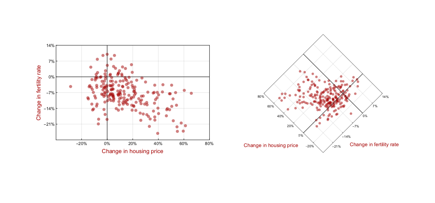
The primary design flaw they identify is the use of the standard x and y-axis. You remember x is the horizontal axis having some effect on the y values along the vertical axis. See, there it is, “some effect” – a causal sounding term. For hard sciences, like chemistry, that description holds true; it even holds for observational data is we substitute predictor variable for x. But often those predictor variables, like age, BMI or ingestion of kale get reduced in our thinking, and the word predictor is lost, leaving just variable and now, of course, it is an easier jump from correlation to causation. Their design suggestion, turning the scatterplot 45 degrees counterclockwise.

The researchers believe the rotation makes the horizontal access less imperative, perhaps less influenced by the cultural norms we bring to visualization; reminding the viewer that “no causal relationship is implied.” They are thoughtful designers; the design change is similar enough to indicate that it is a scatterplot, jarring enough to perhaps remove the imperative of the horizontal axis and the subsequent inclination to think cause rather than correlate. They have taken pains to keep the axis-symmetric, not giving a visual nod to one or the other. Their choice of rotation keeps the origins at the bottom, the labeling easily read in the horizontal, not in some skewed way. The depiction itself is symmetric in height and width, unlike a conventional scatter plot; and they believe that a faintly visible grid provides a bit of orientation in an otherwise disorienting presentation. Tufte should be proud.
Now whether the new design accomplishes its goals remains an unanswered research question. I suspect not, but the discussion and subsequent redesign throw light on an area of design we frequently disregard. Data captured in tables is numbing and challenging to analyze. Our visual system, as Minard’s graphic demonstrates, is capable of a much more refined analysis combining information from color and size and location in a way that is a distant aspiration for tabular reading. The design of these presentations can influence how we understand what we are seeing and are a blend of our physiologic perceptual limitations and bias as well as cultural norms.
Source: Why Scatter Plots Suggest Causality, and what we can do about it. arXiv: 1809.09328v1


