But in most instances, the problem is really two old cognitive difficulties, numbers appear far more precise and concrete than they actually are and a number by itself has little meaning, it requires the context, often another number – ratios.
Rate of Infection
R0 is a means of quantifying how infectious the virus is, and you have all seen the numbers suggesting that it is worse than seasonal flu and not as bad as measles. Knowing the rate of infection is a way to get a handle on how quickly COVID-19 has spread, and that often is described as the rate of infection for a given population. The explicit ratio is the number of infected individuals divided by the size of the community. But hidden in the number of infected individuals lies another, essential set of numbers – how many people are being tested and the incidence of positive findings.
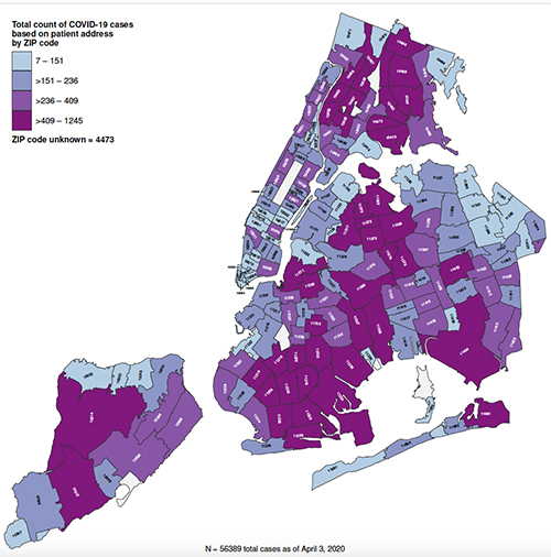
A study of the available data from New York City [1] broken out by zip code is instructive. Recently, the press has made quite a point of discussing the socioeconomic disparities in COVID-19’s victims, largely the same groups that suffer from inadequate access to medical care, lower incomes, and additional co-morbidities. And looking at the map of the five boroughs confirms those findings. Those purple areas include the Bronx, parts of Queens, Brooklyn, and Staten Island. But are those numbers accurate?
The researcher made use of COVID-19 testing information, available by zip code, and integrated it with census data, describing the general characteristics of the zip code, income, housing, minority representation. That data doesn’t tell a different story, but it shows that the number of infected individuals may be significantly underestimated.
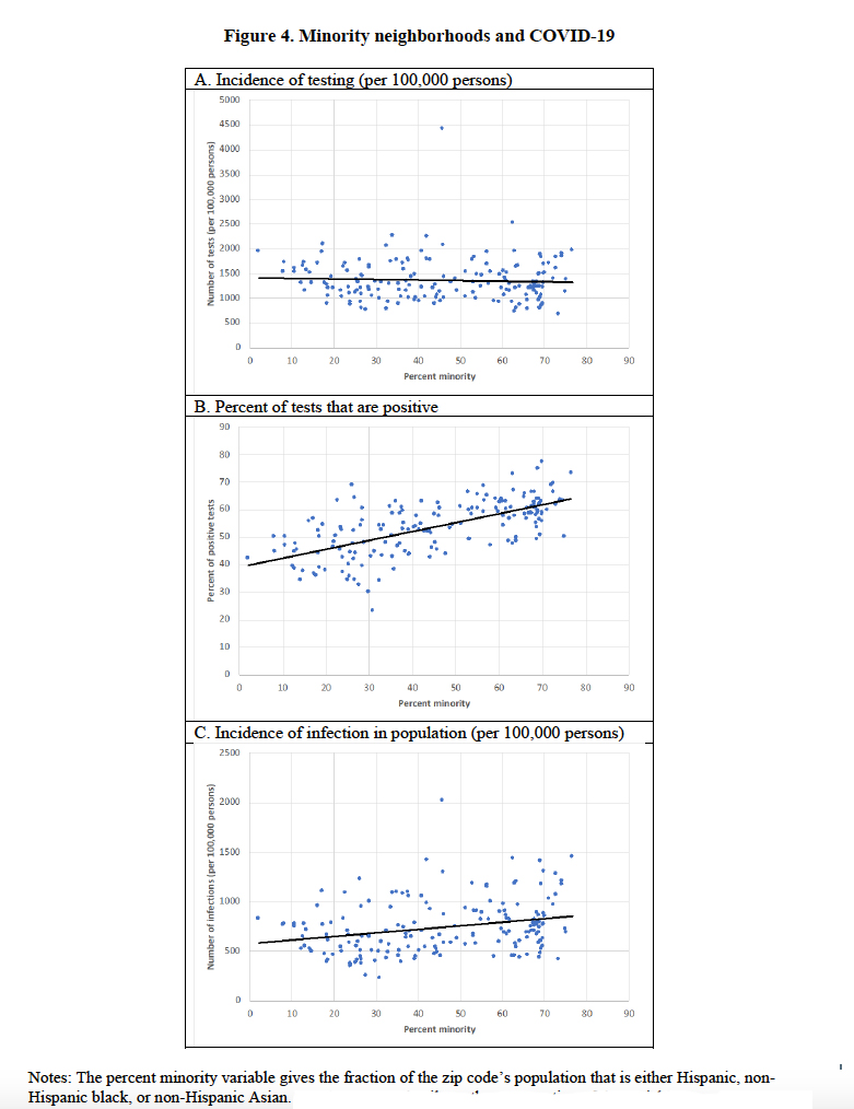
 Graph A shows that the number of tests performed does not vary with a community’s minority status; politically, New York’s city and state government is testing without racial bias.
Graph B shows that predilection of COVID-19 for minority communities, the greater the percentage, the higher the rate of positive tests.
Those two trends come together in Graph C, the incidence or number of infected individuals. You can see that the equality of testing has inadvertently lowered the impact of those positive tests. What is politically correct is not appropriate for public health measurements. More testing needs to be done in the hotspot zip codes, and less in the parts of New York where we can see the incidence is less.
Before some jump to attribute this to politics, remember that this is, in part, a chicken and egg problem, you can’t focus testing until you have a better idea where to focus. But intent aside, you can begin to see why infectivity rates can vary so much. The amount of testing, the true incidence in the population, and the population’s size are aggregated within that one number. And that fails even to consider other pertinent factors, like population density, age, and co-morbidities. For as much as the number seems concrete, it is built upon many forces pulling in different directions.
COVID-19 Deaths
Well, we can understand how infectivity may be challenging to quantify, but surely death is easier – you are either alive or dead, a binary option. The difficulty in quantifying death begins the moment after all vital signs go to zero. Because death can be the result of a criminal act, it comes with regulations, the most important being that a physician must both certify and identify the reasons for death.
“A cause of death is the morbid condition or disease process, abnormality, injury, or poisoning leading directly or indirectly to death. The underlying cause of death is the disease or injury which initiated the train of morbid events leading directly or indirectly to death or the circumstances of the accident or violence which produced the fatal injury. A death often results from the combined effect of two or more conditions. These conditions may be completely unrelated, arising independently of each other or they may be causally related to each other, that is, one cause may lead to another which in turn leads to a third cause, etc.
…He is requested to report in Part I on line (a) the immediate cause of death and the antecedent conditions on lines (b), (c) and (d) which gave rise to the cause reported on line (a), the underlying cause being stated lowest in the sequence of events. However, no entry is necessary on I(b), I(c) or I(d) if the immediate cause of death stated on I(a) describes completely the sequence of events.”
In the case of COVID-19, a certificate might state that the immediate cause was viral pneumonia due to Coronavirus, along with antecedent conditions, co-morbidities, like hypertension and coronary artery disease. There is a 216-page manual [2], that determines which among those immediate and antecedent causes is finally reported as the “cause of death.” That is usually a good thing because, for deaths in large hospitals, the duty to certify often falls to the first-year resident, who knows the least about any given patient. In community hospitals, it falls to the attending physician, and for deaths at home, to the patient’s primary care physician; but while they know the patient’s history better, it would be a rare case when they were specifically trained in completing a death certificate. And I seriously doubt that any physician, other than a pathologist who studies dead patients, has even a nodding acquaintance with that 216-page manual.
To further simplify the attribution of death in the time of pandemic, Italy’s overwhelmed health system decided that any deaths in the hospital were attributed to COVID-19. That, of course, increases the false-positive reports, increasing the deaths. It is balanced to some unknown degree by the physicians certifying deaths at home as not being due to COVID-19, the false negatives. This week, as reported by the New York Post, our federal government has opted for the same path, all deaths involving COVID-19 are attributable to COVID-19. As in Italy, it will mean higher death rates.
If you look at the current CDC data, you will find that a COVID-19 death does not require laboratory evidence, it is sufficient that “the certifier suspects COVID-19 or determines it was likely.” Another important limitation noted is this provisional information is incomplete, and “the level of completeness varies by jurisdiction, week, decedent’s age, and cause of death. … It is important to note that the true levels of completeness are unknown, and the estimates provided here are only a proxy.” It has taken, in the past, up to 2 months to gather and verify 72% of pneumonia deaths.
Again, before jumping to identify a political intent to these changes, it is perhaps best to recognize how overwhelmed is the health system’s information technology. It was probably better prepared to deal with a computer virus than an actual one. But what is one bureaucrat’s efficiency in making all deaths due to COVID-19 is a researcher’s nightmare making it far more challenging to tease out how the virus behaves. This was not a step towards transparency in data
Source: [1] Demographic Determinants of Testing Incidence and COVID-19 Infections in New York City Neighborhoods Institute of Labor Economics and National Bureau of Economic Research.


